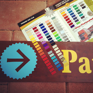
Today I am selecting font colors for Way Finding Signs for the Historic District in Buckeye, Arizona. This project was first called to the attention of the Buckeye Main Street Coalition in February of this year. Finally, they are being constructed by Motivational Systems Inc., a local signage company.
I want to make sure the font is more on the lighter side of things so it really reads against the dark rusted metal background. We initially decided to go with the colors that make up the Town of Buckeye logo of pink, purple, blue and yellow. It really works.
We selected materials such as contrasting rust stained steel in keeping with the look and feel of Buckeye. The frames will be constructed with a rusted pipe steel and the panels will be made of a treated steel corrugated panel. If you drive along MC85 you will see a patchwork of weathered building materials. It is important to show there is progress with new construction but also a nod to the Buckeye heritage of using what you have on hand.
Above is one of the many sun burnt weathered relics you will find along MC85 headed west.
This is the former Eastman Cotton Gin that will continue to inspire future designs. The best results come from up-cycled materials mixed with new when it comes to revitalization for Main Street Buckeye.
We incorporated aspects that we liked from the current welcome signage. The font is a standard for Down Town Buckeye.
Here is the final design that is being built. There will be 12 new monument and freestanding signs by the first of 2013 to help you navigate your way to Historic Buckeye.


This is the start of great things to come!
ReplyDeleteExciting